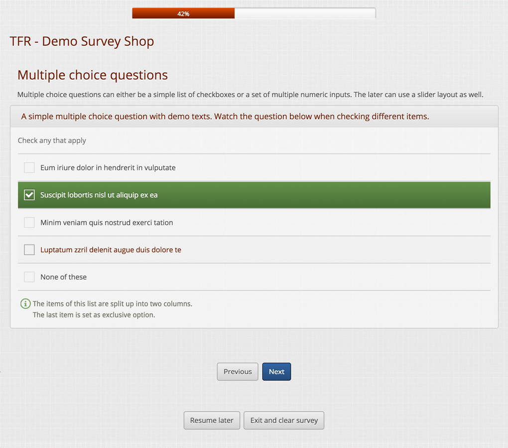
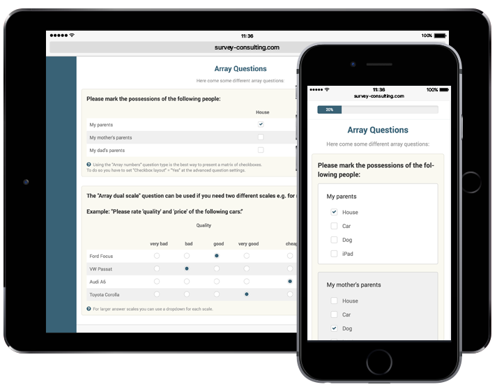
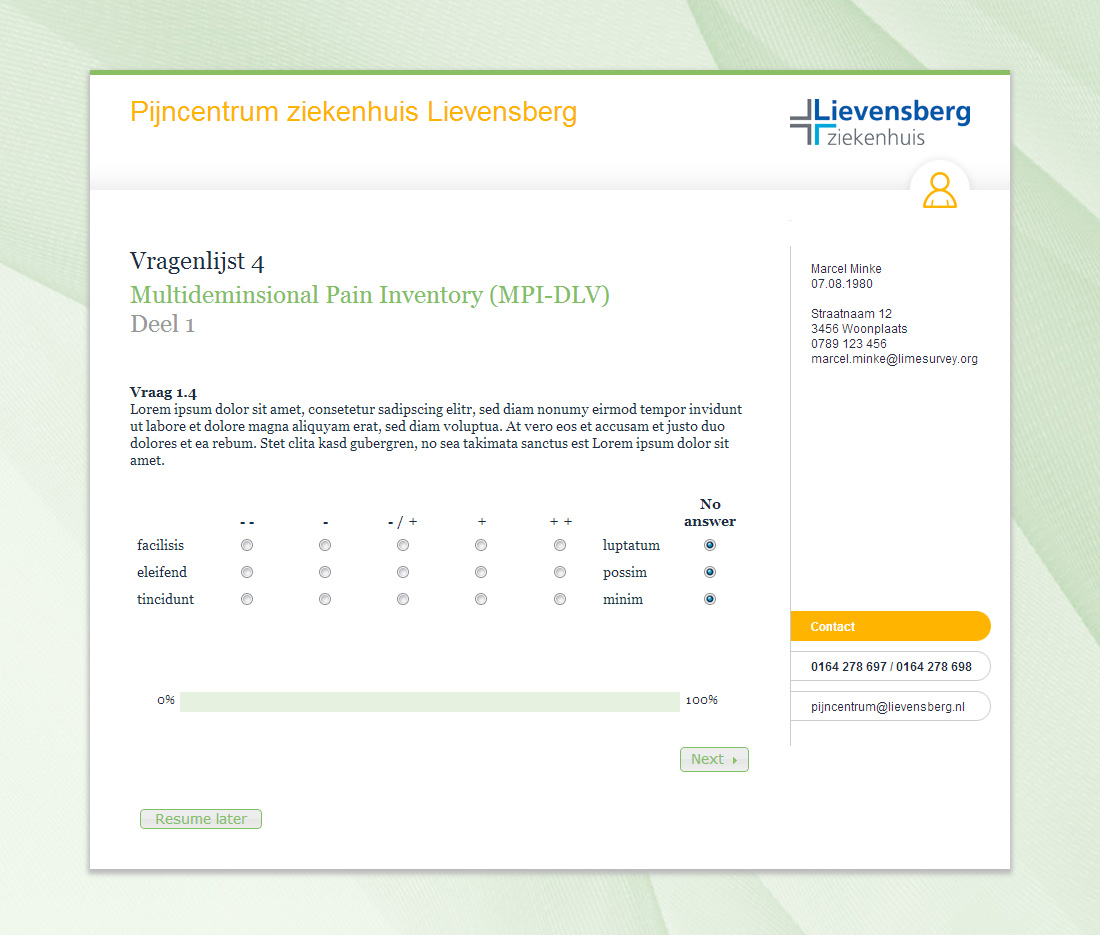
In the recent years we have created dozens of professional Limesurvey themes for different customers. Here we want to present some examples.
If there is a certain theme which you like a lot, drop us a note and we can provide you with a cost estimation for adjusting that theme according to your corporate design.
Some of these Limesurvey themes are also available form download at the Limesurvey Shop.
Basic Limesurvey themes
Limesurvey theme Backy
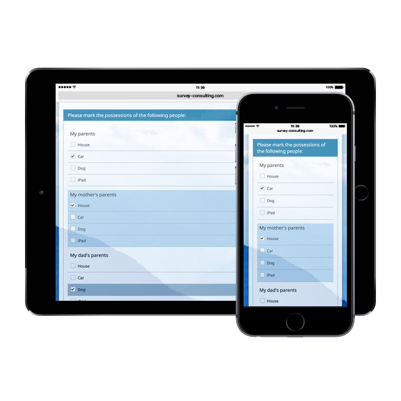
One of the first Limesurvey themes we created with the new Twig technology introduced at Limesurvey 3.x is the Backy theme. At this theme we have added many theme options so you can easily modify colors, footer texts or a background image.
Besides a custom background image you can have your own logo top left and/or right or alternatively show a banner on top. You only need to upload the image file(s) at Limesurvey and can then set which details the theme will display. You do not need any coding or HTML skills for this.
If you want to use this modern and flexible theme you can download it from our shop.
The theme is available for Limesurvey versions 3.x and later.
Want to check how a real Limesurvey survey looks with this design? No problem, we have created two different demos for you:
Limesurvey theme TFR Responsive
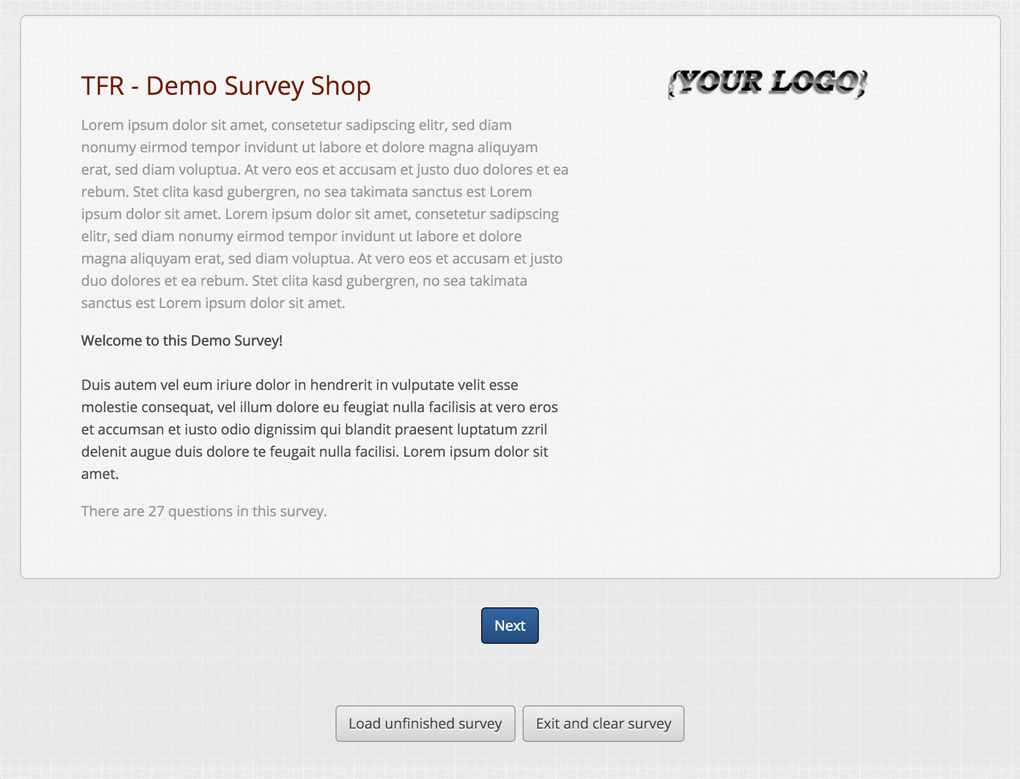
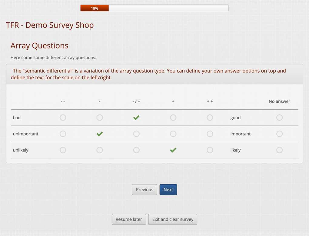
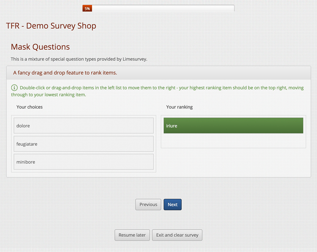
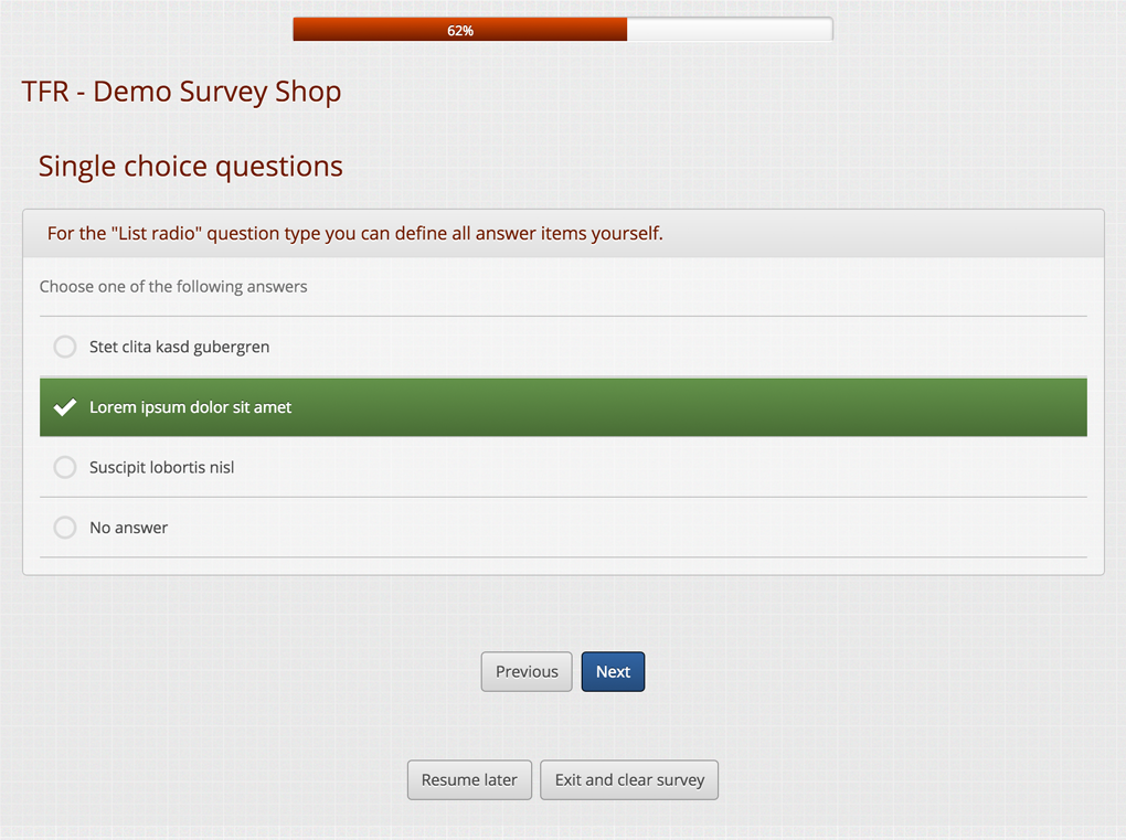
For the old Limesurvey 2.x versions, the TFR Responsive theme was our best seller because it was the first that was fully responsive. Today, all of our shop themes or customized themes display well on different screen sizes.
Over the last years we slightly modernized the TFR Responsive design. The latest version comes with modern fonts and icons. As usual, we tested it with all the latest browsers. Click here to download this theme.
This is the preferred Limesurvey theme of customers for running surveys on tablets or mobiles. The answer options are outlined in a button style which makes them easy to click. Have a look at our demo survey to check yourself.
Limesurvey theme Janus
Janus is a fully responsive Limesurvey theme. It scales very well not only on small devices such as smartphones but also on larger devices like iPads or other tablets.
You can download this theme at our shop.
The Janus theme is one of our oldest themes. We adjusted it for newer Limesurvey versions over the years. Since Limesurvey v3.x you can easily replace the logo placeholders with your own logo. For this we have added support for logos top left, middle and right so you can add up to three custom logos easily.
In addition to that, you can also have your own favicon to shown at the browser tabs. A custom footer at which you can place links to your imprint or data privacy details is supported as well.
You can test it at this demo survey.
Fully customized Limesurvey themes
For commercial surveys we recommend using a fully customized theme. Not only does it increase the response rate, but it also makes your survey appear more professional. Creating such custom themes is our daily business. We have created > 250 themes for Limesurvey in the past and can also help with update existing themes for new Limesurvey versions.
Sometimes customers come up with some additional, special requirements which may be a little challenging. But we can help with that as well. Some of these special themes are shown below.
Limesurvey theme HealthVision
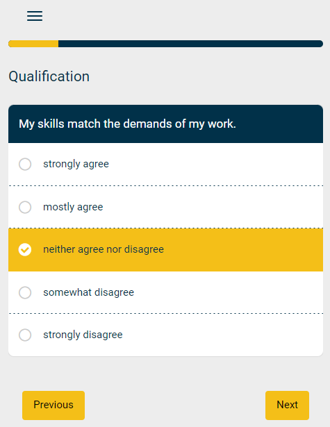
HealthVision is a German health consulting agency helping companies to keep their employees healthy. They developed various tools based on Limesurvey for reviewing the health status.
Their surveys connect with an internal data analysis tool using the Limesurvey API. Furthermore, this customer had special requirements regarding the theme design. Besides a mobile optimized layout they requested a special question index. The index indicates which survey pages the user has fully answered and which sections are still missing responses.
The smaller screenshot shows the mobile layout. The index pops up when clicking the small menu icon top left.
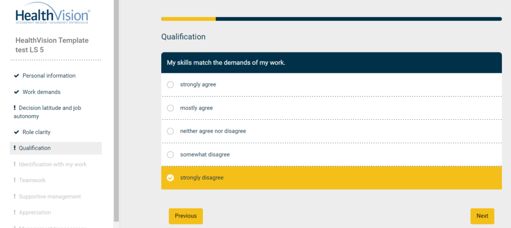
The below images illustrate the survey design in general as well as the completion state at the question index on the left.
Preview of a default question page with some answers filled in:
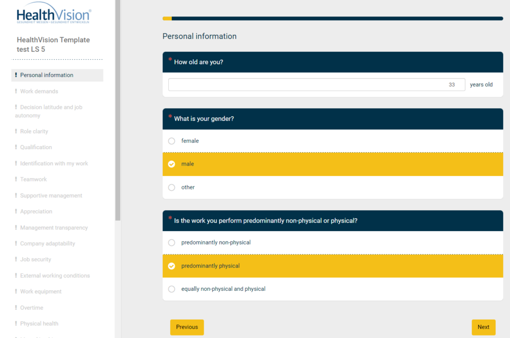
This preview of survey page #5 shows the completion status at the question index on the left. Completed pages are marked with a check icon. Pages missing some answer details have an exclamation mark noted. Future pages are greyed out.
Limesurvey theme Pijncentrum
A hospital in The Netherlands was asking for a special theme optimized for a certain survey layout. On the left the survey questions are shown while on the right the data of the currently surveyed patient is displayed. We achieved this by making use of placeholders to dynamically load the patient data into predefined boxes on the right.
This customer supplied us with quite detailed requirements like a larger and differently placed progress bar, different button placement and a detailed color scheme. At the image gallery below you can have a look at different screenshots of this custom Limesurvey theme.
