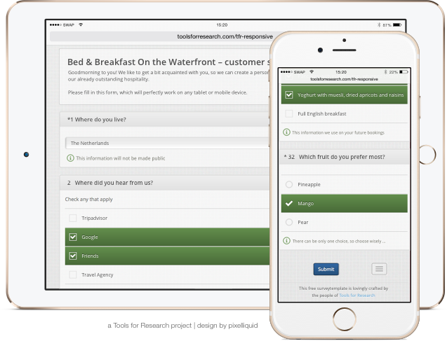
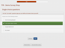
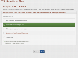
We could probably write 10-12 pages about how to create a fully responsive LimeSurvey template but we want to spare you from reading about all the technical details. Instead, we just want to sum up our findings and present you the results.
Several people have spent dozens of hours to create the first fully responsive LimeSurvey template. You can test the template at this test survey and buy the “TFR Responsive” LimeSurvey template at the LimeSurvey Template Shop.
Benefits of using a responsive LimeSurvey template
Of course, the biggest benefit of a fully responsive LimeSurvey template is easily serving lots of different devices and presenting the survey questions well displayed on each of them. This does not only make your survey look more professional it will also lead to an increased response rate.
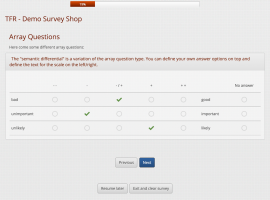
Furthermore, a known disadvantage of common LimeSurvey templates is the lack of support for touch screen devices such as smartphones and tablets. Using such a device it can be really tricky to click a radio button or tick the small check boxes. Participants being frustrated because of such a badly designed user interface may just close the survey and leave. When using our fully responsive LimeSurvey template participants can just click the text of an answer option at single or multiple choice question to mark an item. At array questions we made the whole cell clickable so even on small devices it is really easy to answer the survey questions. In addition to that the display of larger array questions is optimized by using responsive tables which means that a large table gets split up into several smaller ones which display nicely on small screens.
Technical details
The template we created is based on the bootstrap framework which is famous for serving different devices nicely. For supporting high quality images we make use of Retina JS which supports dynamic switching to a high quality version of an image or logo file if a retina display is used by the participant.
A known issue when using small devices is displaying large array questions nicely. We implemented the “No more tables” JavaScript library at our responsive LimeSurvey Template which dynamically splits up large LimeSurvey array questions into smaller sections which display fine even on very small devices.
Furthermore, we added custom icons and “Open Sans” as a modern font to achieve a pleasant look and feel so that our template doesn’t look as boring as the shipped LimeSurvey templates.
Additional information/links
Sounds interesting? -> Check this test survey.
Want to use this fully responsive LimeSurvey template? -> Get the “TFR Responsive” LimeSurvey template at the LimeSurvey Template Shop.
Want to see more high quality screenshots? -> There you go:

