Introduction
Tooltips are a useful feature if you want to add lengthy explanations to certain keywords or answer options at LimeSurvey. Since LimeSurvey v3.0 the Bootstrap framework is available for all LimeSurvey templates which enables you to easily add tooltips to your survey elements. We will show you how this works.
Adding tooltips to LimeSurvey survey elements
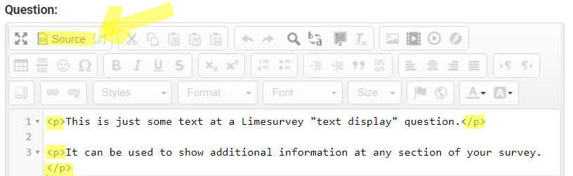
Bootstrap tooltips need to be added by using proper HTML elements. You can see these elements by switching to the source code view of the LimeSurvey editor. We have highlighted default HTML elements:
If we now want to use a tooltip for a certain keyword we need to add an additional HTML element. Placing the keyword within a SPAN element is the recommended approach since it shouldn’t change the formatting of the text.
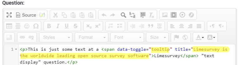
For highlighting the word LimeSurvey and adding explanatory text using a tooltip we can use the following HTML:
<span data-toggle="tooltip" title="LimeSurvey is the worldwide leading open source survey software">LimeSurvey</span>This is how it looks like at the source code mode of the LimeSurvey editor:
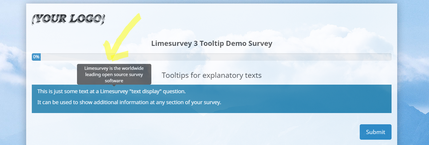
And this is how the tooltip shows up when running the LimeSurvey survey:
Tooltip core elements
As you can see from the above screenshot it only takes three core elements:
- HTML <span>…</span> element for adding the tooltip
- data-toggle=”tooltip” for indicating that the element uses a tooltip
- title=”Your tooltip text” for defining the to be shown tooltip text
There are some more details your can add to adjust and improve your tooltips:
- data-html=”true” allows using HTML within the tooltip itself e.g. to highlight certain words within the tooltip with bold text, example:
title=”LimeSurvey is the worldwide <strong>leading</strong> open source survey software” - data-placement=”auto | top | bottom | left | right” where auto is the default value. This setting allows defining how the tooltip will be positioned.
Adjusting the tooltip styles
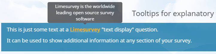
If you have a look at the screenshot above you will notice that the word LimeSurvey is not marked in any way to indicate that it uses a tooltip. So users won’t know that additional information is available. To change this, we can add an additional CSS class mytooltip to the above element and then add styles to the custom.css file of the LimeSurvey template used to highlight words with tooltips.
This is the extended HTML code for our tooltip:
<span class="mytooltip" data-toggle="tooltip" title="LimeSurvey is the worldwide leading open source survey software">LimeSurvey</span>At the custom.css file we are adding the below lines of code to
a) change the cursor on hover
b) underline the word
c) show the keyword as bold text
d) highlight the tooltip keyword with a different color
.mytooltip
{
    cursor: pointer;
    text-decoration: underline;
    font-weight: bold;
    color: orange;
}
This is what we get:
Tooltips for LimeSurvey answer options
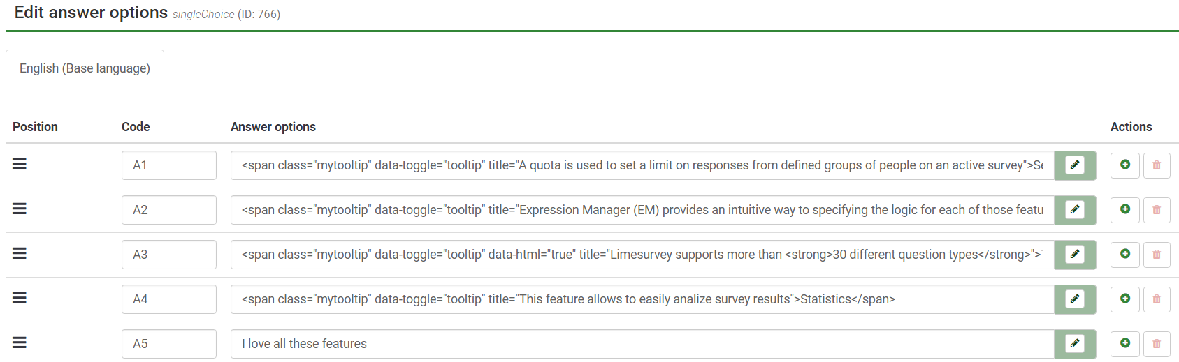
Sometimes you need to explain what a certain answer option means while you try keeping the answer text as short as possible so the answers are still easily readable. Using tooltips you can have short answer options with additional explanations being shown as tooltips. We have created an example for this as well. This is how the answer options are added at a LimeSurvey single choice question:
And this is how it looks like at the survey:
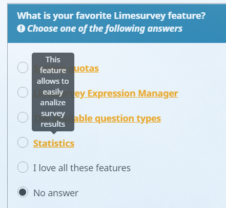
You may notice that the tooltip element at the above example is rather small. This is because by default the size is related to the width of the underlying text. In order to increase the tooltip width for list radio or multiple choice questions we can add the following CSS code to our custom.css file:
.tooltipquestion li.radio-item label,
.tooltipquestion li.checkbox-item label
{
width: 100%;
}
.answer-item .tooltip .tooltip-inner
{
max-width: 75%;
margin: auto;
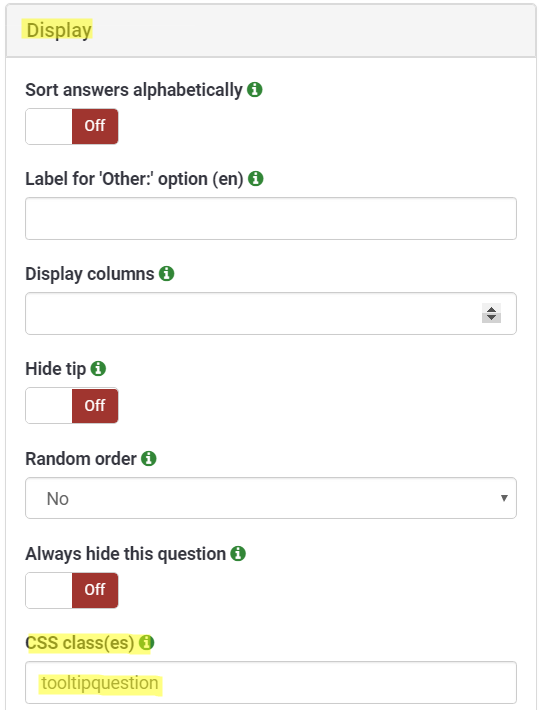
}As you can see there is now an additional class tooltipquestion. This is needed because we need to overwrite the default styles for the labels of checkbox and radio items. To not apply this to all questions we add the class manually to all questions using tooltips. This can be set at the Display section when editing any LimeSurvey question:
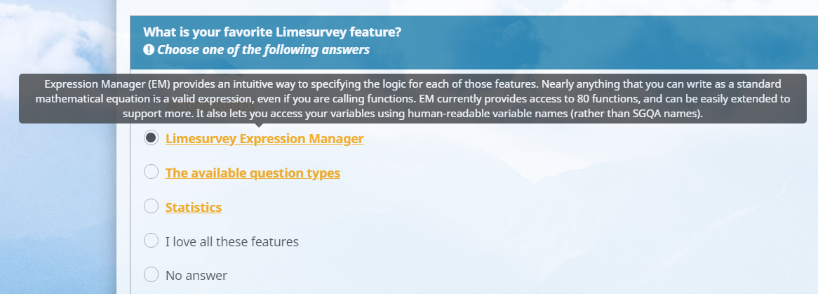
Lengthy tooltip are now shown like this:
Additional information and downloads
Here are some helpful links for you:
- LimeSurvey demo survey
- Download LSS file (right click, select Save as…) of demo survey
- Download the template used for the demo survey
- Additional information about the Bootstrap tooltip feature